See Your Scheduling Metrics on Prometheus and Grafana
See your scheduling metrics on Prometheus and Grafana – it sounds technical, right? But trust me, unlocking the power of these tools to visualize your scheduling performance is way more exciting than it sounds! Imagine having a crystal-clear dashboard that instantly reveals bottlenecks, inefficient processes, and potential areas for optimization in your scheduling workflows. This post will guide you through the process, from setting up Prometheus to create stunning visualizations in Grafana, all while keeping things surprisingly straightforward.
We’ll dive into the nitty-gritty of configuring Prometheus to collect your scheduling data, crafting insightful Grafana dashboards, and using this combined power to identify and resolve scheduling issues. Think of it as getting a supercharged view of your system’s heartbeat, allowing you to proactively address problems before they become major headaches. Get ready to transform your understanding of scheduling efficiency!
Prometheus Data Collection for Scheduling Metrics
Getting reliable scheduling metrics is crucial for optimizing your systems. Prometheus, with its powerful querying capabilities and flexible data model, provides an excellent solution for collecting and visualizing this data. This post details how to configure Prometheus to scrape scheduling data, the metrics you should track, and how to use PromQL to analyze your scheduling performance.
Configuring Prometheus to Scrape Scheduling Data
Prometheus collects metrics by periodically scraping HTTP endpoints exposed by various targets. These targets can range from custom-built exporters specifically designed for scheduling systems to databases or applications that expose relevant metrics through APIs. For instance, a database might offer metrics on the number of pending queries, while an application might provide data on task completion times. The process involves defining these targets within Prometheus’s configuration file (typically `prometheus.yml`), specifying the scraping interval, and ensuring the targets are correctly configured to serve the metrics.
If no suitable endpoint exists, you might need to develop a custom exporter.
Defining Effective Prometheus Metrics for Scheduling
Choosing the right metrics is vital for understanding your scheduling system’s performance. Some key metrics include:
job_queue_length: A gauge metric representing the current number of jobs waiting to be processed. This helps identify potential bottlenecks.task_processing_time_seconds: A histogram metric recording the time taken to process individual tasks. This allows you to analyze task durations and identify slow tasks.resource_utilization_percent: A gauge metric representing the percentage of resource utilization (CPU, memory, network, etc.). This metric helps identify resource constraints.scheduled_tasks_total: A counter metric that tracks the total number of tasks scheduled over time. This is useful for trend analysis.failed_tasks_total: A counter metric counting the number of failed tasks. This metric helps in identifying and resolving recurring issues.
These metrics, along with others specific to your scheduling system, provide a comprehensive overview of its health and performance. The choice of metric type (gauge, counter, histogram) depends on the nature of the data.
Using PromQL to Query Scheduling Metrics
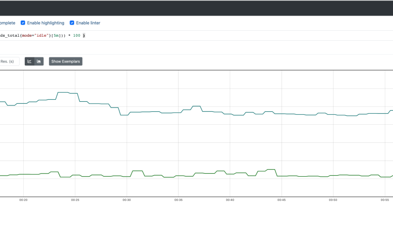
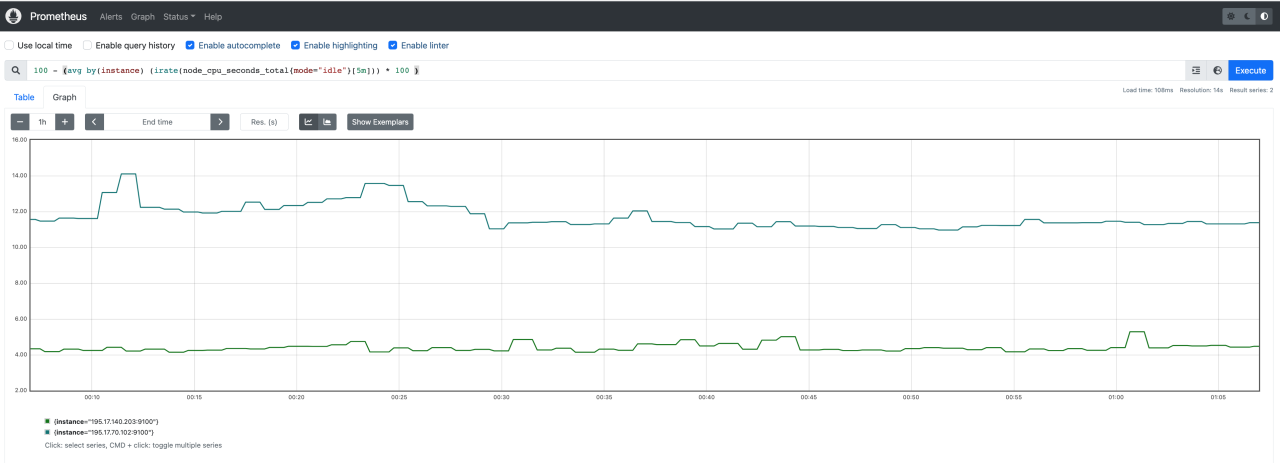
Prometheus’s query language, PromQL, allows you to retrieve and filter scheduling metrics effectively. For example, you can use the following queries:
job_queue_length: Returns the current length of the job queue.avg(task_processing_time_seconds): Calculates the average task processing time.sum(rate(failed_tasks_total[5m])): Calculates the rate of failed tasks over the last 5 minutes.histogram_quantile(0.99, sum(rate(task_processing_time_seconds_bucket[5m])) by (le)): Calculates the 99th percentile of task processing time over the last 5 minutes.
PromQL provides powerful functions for aggregation, filtering, and time-series analysis, allowing you to drill down into specific aspects of your scheduling performance. Understanding PromQL is essential for effective monitoring and troubleshooting.
Example Prometheus Configuration File
Below is a sample `prometheus.yml` configuration snippet showcasing how to configure Prometheus to scrape scheduling metrics from a hypothetical endpoint:
“`yamlscrape_configs:
job_name
‘scheduler’ static_configs:
targets
[‘scheduler:9100’] labels: job: ‘scheduler’“`
This configuration instructs Prometheus to scrape metrics from the `scheduler` service running on port
9100. You’ll need to adapt this to your specific scheduling system and endpoint. Remember to replace `scheduler
9100` with the actual address and port of your metric endpoint. You’ll also need to define the metric names and labels consistently across your system and exporter.
Grafana Dashboard Design for Scheduling Visualization
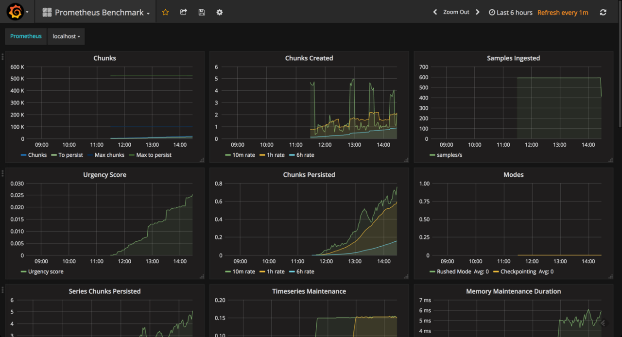
Designing effective Grafana dashboards for visualizing scheduling metrics collected by Prometheus requires careful consideration of panel types, layout, and the overall user experience. The goal is to provide clear, concise, and actionable insights into the health and performance of your scheduling system. A well-designed dashboard allows for quick identification of bottlenecks, anomalies, and areas needing optimization.
The key is to present the data in a way that is both informative and easily digestible. Overly complex dashboards can be overwhelming and counterproductive. Instead, focus on the most critical metrics and present them in a clear and organized manner. This involves choosing the right panel types for different data sets and arranging them logically within the dashboard.
Grafana Dashboard Layout and Panel Types
A well-structured Grafana dashboard is crucial for effective visualization. The following table demonstrates a sample layout using four responsive columns, each containing different Grafana panel types to showcase various aspects of scheduling performance.
| Column 1 | Column 2 | Column 3 | Column 4 |
|---|---|---|---|
| Panel Type: Time Series Graph Metric: Average Job Execution Time Description: A line graph showing the average time taken to execute jobs over time. This helps identify trends and potential slowdowns. Color-coding could be used to highlight different job types. |
Panel Type: Gauge Metric: Number of Jobs in Queue Description: A gauge displaying the current number of jobs waiting to be executed. This provides a real-time view of the queue length and potential backlogs. A threshold could be set to trigger alerts when the queue exceeds a certain limit. |
Panel Type: Table Metric: Top 10 Longest Running Jobs Description: A table listing the ten longest-running jobs, along with their execution times and start times. This helps pinpoint jobs that might be causing performance bottlenecks. |
Panel Type: Histogram Metric: Job Execution Time Distribution Description: A histogram showing the distribution of job execution times. This helps visualize the range of execution times and identify outliers. |
Utilizing Annotations and Alerts
Annotations and alerts significantly enhance the usefulness of Grafana dashboards for scheduling monitoring. Annotations allow you to add contextual information to the graphs, such as notes about deployments, maintenance windows, or other significant events that might impact scheduling performance. For example, annotating a graph with the time of a server restart can help explain a sudden drop in job throughput.
Alerts, on the other hand, provide automated notifications when critical thresholds are breached. For instance, an alert could be configured to trigger when the number of jobs in the queue exceeds a predefined limit, or when the average job execution time surpasses a certain threshold. These alerts can be sent via email, PagerDuty, or other notification systems, ensuring timely responses to potential issues.
Creating Multiple Dashboard Views, See your scheduling metrics on prometheus and grafana
Offering different views of scheduling performance is key to catering to various user needs. A high-level overview dashboard can provide a summary of key metrics, such as overall job throughput, average execution time, and queue length. This allows for a quick assessment of the overall health of the scheduling system. A more detailed dashboard could then provide breakdowns by job type, application, or other relevant dimensions, allowing for more in-depth analysis and troubleshooting.
For example, one dashboard might focus on overall system performance, while another might drill down into the performance of specific job queues or applications. This modular approach allows different teams or individuals to access the information most relevant to their responsibilities.
Analyzing Scheduling Bottlenecks
So, you’ve got your Prometheus metrics humming along, feeding juicy data into your Grafana dashboards. That’s fantastic! But the real magic happens when you use this visualization power to pinpoint and resolve scheduling bottlenecks. This section dives into the practical application of Prometheus and Grafana for optimizing your scheduling workflows. We’ll explore how to identify bottlenecks, compare different scheduling strategies, and ultimately improve performance.Identifying potential bottlenecks requires a keen eye and a methodical approach.
We aren’t just looking at pretty graphs; we’re hunting for anomalies and trends that indicate areas of inefficiency. By understanding how your system behaves under various loads, you can proactively address potential problems before they impact your users.
Monitoring your app’s scheduling with Prometheus and Grafana gives you amazing insights into performance. Understanding these metrics becomes even more critical when you’re building complex applications, like those created using the innovative approaches discussed in this great article on domino app dev the low code and pro code future. Back to Prometheus and Grafana, remember that efficient scheduling directly impacts user experience and overall app stability, so keep a close eye on those graphs!
Identifying Bottlenecks Through Metric Analysis
Analyzing key Prometheus metrics within Grafana reveals potential bottlenecks. For instance, consistently high values for the `job_execution_time` metric might indicate that certain tasks are taking longer than expected. Similarly, a surge in the `queue_length` metric could signify a backlog of pending jobs, pointing to insufficient resources or poorly optimized scheduling algorithms. Examining these metrics over time, perhaps using Grafana’s time series capabilities, allows you to identify patterns and pinpoint specific times or events that correlate with performance degradation.
For example, a spike in `job_execution_time` coinciding with a peak in user activity might suggest that your system is struggling to handle the increased load. Another example could be a consistent increase in `queue_length` during specific hours of the day, indicating a predictable resource constraint that could be addressed by adjusting resource allocation or scheduling policies.
Comparing Scheduling Strategies
Grafana dashboards provide an excellent environment for comparing the performance of different scheduling strategies. Let’s imagine you’re A/B testing two different algorithms: a first-come, first-served (FCFS) approach and a priority-based system. You could create separate panels within a single Grafana dashboard to visualize key metrics like `average_job_completion_time` and `queue_length` for each strategy. By visually comparing these metrics, you can readily determine which algorithm yields better performance under various conditions.
For example, you might find that the priority-based system consistently delivers lower average job completion times, but at the cost of potentially increased queue length for lower-priority jobs. This visual comparison facilitates data-driven decision-making, allowing you to choose the strategy that best aligns with your specific performance goals and service level agreements.
Optimizing Scheduling Performance
Once you’ve identified bottlenecks and compared different strategies, you can begin to optimize your scheduling performance. This might involve several steps. For example, if you’ve identified a specific task consistently contributing to high `job_execution_time`, you could investigate ways to optimize that task’s code or allocate more resources to it. If the `queue_length` metric indicates a persistent backlog, consider scaling up your infrastructure (adding more compute nodes or increasing memory) or refining your scheduling algorithm to better distribute the workload.
Another approach might be to implement a more sophisticated queuing system that prioritizes critical jobs. The key is to use the insights gained from Prometheus and Grafana to make targeted improvements, iteratively refining your scheduling strategy until you achieve optimal performance.
Structured Reporting of Analysis Findings
A well-structured report summarizing your analysis is essential for sharing your findings and justifying any changes to your scheduling system. This report should include: a clear statement of the problem, a description of the methodology used (Prometheus and Grafana), the key metrics analyzed, visualizations from your Grafana dashboards (screenshots or embedded images), a discussion of the identified bottlenecks, a comparison of different strategies (if applicable), and a detailed explanation of the implemented optimizations and their impact.
This structured approach ensures clarity and facilitates effective communication with stakeholders. Consider including tables summarizing key performance indicators before and after optimizations, clearly showing the improvements achieved. For instance, a table comparing average job completion times before and after implementing a new scheduling algorithm would be highly valuable.
Alerting and Monitoring for Scheduling Issues: See Your Scheduling Metrics On Prometheus And Grafana
Proactive monitoring is crucial for maintaining the health and efficiency of any scheduling system. Without it, performance degradation can go unnoticed, leading to significant delays and potential failures. A robust alerting system, integrated with Grafana and Prometheus, allows us to detect and respond to scheduling bottlenecks before they impact our users. This ensures timely intervention and prevents cascading failures.
Grafana Alert Configuration and Notification Channels
Grafana’s alerting engine provides a powerful mechanism to define thresholds and trigger notifications based on Prometheus metrics. The configuration involves specifying the target metric, threshold values, and notification channels. Notifications can be sent through various channels including email, Slack, PagerDuty, or custom webhooks, depending on your team’s preferred communication methods. This flexibility ensures alerts reach the appropriate personnel quickly, regardless of their location or preferred communication style.
For example, an alert could be configured to send an email to the on-call engineer and a Slack message to the entire development team.
Defining Alert Thresholds for Scheduling Metrics
Choosing appropriate alert thresholds is vital for preventing alert fatigue (too many alerts) and missed critical alerts. The thresholds should be determined based on historical data, system capacity, and service level objectives (SLOs). For instance, a high queue length might trigger an alert if it exceeds 80% of the maximum queue capacity for more than 5 minutes. Similarly, if task processing times consistently exceed a pre-defined SLA of 10 seconds, an alert should be generated.
These thresholds need to be carefully calibrated; setting them too low results in frequent, often unimportant alerts, while setting them too high risks missing critical issues.
Examples of Grafana Alert Rules
Let’s consider some practical examples of Grafana alert rules for common scheduling scenarios.
Scenario 1: High Queue Length
This alert triggers when the queue length for a specific scheduler exceeds 80% of its capacity for more than 5 minutes. The alert would be sent via email to the designated team. The expression in Grafana’s alert rule would look something like this:
avg_over_time(scheduler_queue_lengthscheduler="scheduler1"[5m]) > 0.8max(scheduler_queue_capacityscheduler="scheduler1")
Scenario 2: Long Task Processing Times
This alert fires if the average task processing time for a particular task type exceeds 10 seconds over a 1-minute window. The notification would go to a Slack channel dedicated to scheduling issues. The Grafana expression might look like this:
avg_over_time(task_processing_timetask_type="typeA"[1m]) > 10
Scenario 3: Scheduler Downtime
This alert is triggered if a scheduler becomes unresponsive for more than 30 seconds. The alert would use a webhook to trigger a runbook automation and simultaneously send email notification to the team. A potential Grafana expression could be:
absent(scheduler_statusscheduler="scheduler2", status="up")[30s]
These are just a few examples; the specific metrics and thresholds will vary based on your specific scheduling system and requirements. The key is to create a comprehensive set of alerts that cover all critical aspects of your scheduling infrastructure. Regularly reviewing and adjusting these alerts is crucial to maintain their effectiveness.
Illustrative Examples of Scheduling Metrics
Understanding your scheduling system’s performance requires careful monitoring of key metrics. These metrics provide insights into efficiency, resource utilization, and potential bottlenecks. By visualizing these metrics in Grafana, you can quickly identify areas for improvement and proactively address scheduling issues before they impact your applications.
Let’s delve into five crucial scheduling metrics, their visual representations in Grafana, and how they help diagnose problems.
Job Queue Length
The job queue length represents the number of tasks waiting to be executed by the scheduler. A consistently high queue length indicates a potential bottleneck. In Grafana, this would be visualized as a line graph showing the number of jobs in the queue over time. A sudden spike might indicate a surge in incoming jobs exceeding the scheduler’s capacity.
A persistently high value suggests insufficient resources or inefficient scheduling algorithms. For example, a sudden increase could be caused by a batch job processing a large dataset, while a consistently high value might indicate a need for more worker nodes or a more efficient task distribution strategy. Interpreting this metric requires considering the average job processing time and the available resources.
Misinterpretations can arise from failing to account for peak load periods or neglecting the impact of slow job processing times on queue length.
Average Job Completion Time
This metric measures the average time it takes for a job to complete, from submission to finish. A Grafana graph would display this as a line graph showing the average completion time over time. Increased average job completion time suggests problems like resource contention (CPU, memory, I/O), inefficient algorithms, or faulty jobs. For instance, a sudden increase might point to a specific job experiencing unusually high resource demands or a temporary hardware issue.
A gradual increase over time could indicate a growing need for more resources or a system-wide performance degradation. Careful analysis is needed to differentiate between normal variations and actual problems. Failing to consider job complexity or variations in resource availability can lead to inaccurate conclusions.
Resource Utilization
This metric tracks the percentage of resources (CPU, memory, network) used by the scheduler and its associated jobs. Grafana can display this as multiple panels, each showing the utilization of a specific resource as a percentage over time. High and sustained resource utilization, especially CPU or memory saturation, signifies potential bottlenecks. For example, consistently high CPU utilization indicates a need for more processing power, while high memory utilization points to memory leaks or inefficient job memory management.
Conversely, consistently low utilization might indicate over-provisioning of resources. It’s crucial to correlate resource utilization with other metrics like job queue length and completion time to understand the relationship between resource constraints and scheduling performance. Misinterpretation might arise from not considering the type of workload or the resource needs of individual jobs.
Scheduling Latency
This metric measures the time delay between a job’s submission and its actual start time. Grafana can show this as a line graph. High scheduling latency suggests problems with the scheduler’s efficiency or resource contention. For example, a sudden increase could be due to a scheduler overload or a temporary resource shortage. A consistently high latency indicates an inefficient scheduling algorithm or insufficient resources.
This metric, when combined with job queue length, can pinpoint whether the bottleneck is in job submission or job execution. Misinterpretations can occur if network latency is not considered separately or if the impact of job priorities is not factored in.
Job Rejection Rate
This metric represents the percentage of jobs that are rejected by the scheduler due to resource limitations or other constraints. A Grafana graph would display this as a percentage over time. A high rejection rate indicates a critical issue where the system is unable to handle the incoming workload. This might be due to insufficient resources, misconfiguration of the scheduler, or faulty jobs.
For instance, a sudden spike could be triggered by a large batch job exceeding resource limits. A persistently high rate demands immediate attention and resource adjustments or scheduler reconfiguration. Ignoring this metric could lead to significant performance degradation and job failures. It is important to analyze the reasons for rejections to identify and resolve the underlying problems.
Summary
Mastering Prometheus and Grafana for scheduling metrics is a game-changer. By visualizing your data effectively, you’re not just monitoring your scheduling performance; you’re actively shaping it. The insights you gain – from identifying bottlenecks to optimizing resource allocation – empower you to build more efficient and robust systems. So, ditch the guesswork and embrace the power of data-driven scheduling.
Start visualizing your success today!
Q&A
What if I don’t have any existing metrics?
You’ll need to implement custom exporters or modify your applications to expose the relevant scheduling data in a format Prometheus can understand (usually using the exposition format).
How often should I update my Grafana dashboards?
The frequency depends on your needs. For real-time monitoring, you might want near-instant updates. For less critical systems, less frequent updates (e.g., every few minutes or even hourly) might suffice.
Can Grafana integrate with other monitoring tools?
Absolutely! Grafana’s strength lies in its ability to connect to various data sources, not just Prometheus. You can combine data from multiple tools for a comprehensive overview.
What are some common pitfalls to avoid when setting up alerts?
Avoid setting overly sensitive thresholds that trigger false positives. Start with conservative thresholds and adjust based on your system’s behavior. Also, ensure you have robust notification channels in place.