Aligning Vector Icons with Text: A Comprehensive Guide for Seamless UI Integration

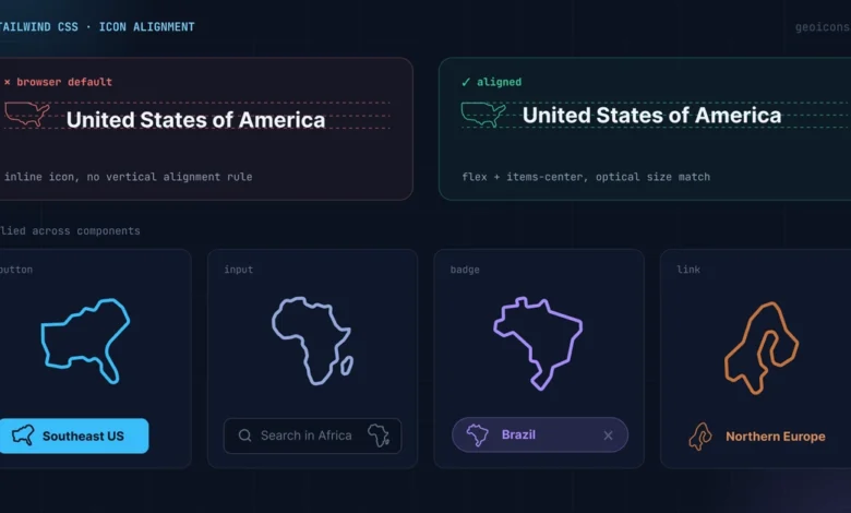
The integration of vector icons into user interfaces, particularly alongside text, presents a common yet often overlooked design challenge. Unlike traditional typographic characters with their defined baselines, ascenders, and descenders, vector graphics possess inherent geometric paths that do not naturally align with text flow. This discrepancy can lead to jarring visual inconsistencies, where icons appear to float awkwardly above or below the intended text baseline when relying on default browser rendering. Addressing this fundamental alignment issue is crucial for creating polished, professional, and user-friendly digital experiences. This comprehensive guide explores the technical nuances and practical solutions for achieving perfect icon-text alignment, leveraging modern CSS frameworks like Tailwind CSS to streamline the process and enhance visual harmony across diverse UI components.
The core of the problem lies in the fundamental difference between text glyphs and graphical paths. Text characters are designed with a consistent vertical rhythm, enabling them to align seamlessly. Icons, however, are essentially shapes that occupy a bounding box. When placed next to text using default browser settings, the browser typically aligns the bottom edge of the icon’s bounding box with the text’s baseline. This results in the visual center of the icon being significantly higher than the text it accompanies, creating an undesirable visual gap.
To illustrate these principles, we will utilize GeoIcons, a library providing clean, optimized map outlines for all countries and regions. The unique characteristic of GeoIcons is that each shape represents a real geographic outline, not a uniform square glyph. This means the same alignment rules applicable to any icon are directly relevant here, and each component is equipped with size and className props, facilitating straightforward implementation.
Anchoring the Visual Centers: The Power of Flexbox
The most fundamental step in rectifying the icon-text alignment gap is to ensure that the visual centers of both elements are precisely aligned. A standard block layout, where elements are stacked vertically, often exacerbates the problem. When raw inline SVG elements are used, their canvas bottom edge aligns with the text baseline, inadvertently pushing the icon upwards.
The solution lies in employing flexbox utilities to create a unified alignment context. By wrapping both the icon and its accompanying text label within a flex container, we gain granular control over their vertical and horizontal positioning. The flex property, combined with items-center, instructs the container to align its direct children along their vertical midpoints. This is the cornerstone of achieving a visually balanced composition.
Consider the following example, demonstrating the application of flexbox for aligning a country icon with its name:
import  Jp  from '@geoicons/react/countries';

export default function CountryBadge()
  return (
    <div className="flex items-center gap-2">
      <Jp size=20 aria-hidden="true" />
      <span>Japan</span>
    </div>
  );
In this code snippet, the div element acts as the flex container. The flex class enables flexbox layout, items-center ensures that the Jp icon and the span containing "Japan" are vertically centered relative to each other. Furthermore, gap-2 introduces a consistent and visually pleasing horizontal spacing between the icon and the text, preventing them from appearing cramped. This simple application of flexbox fundamentally corrects the initial misalignment, ensuring the icon’s visual center aligns with the text’s implied center.
The immediate effect of items-center is to align the vertical midpoints of both child elements. This means the horizontal line running through the middle of the icon will also run through the middle of the text. The gap-2 utility then adds a standardized horizontal space, preventing visual clutter and reinforcing the cohesiveness of the paired elements. This approach is robust and adaptable, forming the basis for more refined alignment adjustments.
Matching Icon Size to Line Height: Ensuring Vertical Harmony
Beyond centering, the relative sizing of icons to the surrounding text’s line height plays a critical role in maintaining vertical harmony. Default Tailwind CSS body text, often utilizing the text-base class, typically corresponds to a font size of 16 pixels and a line height of 24 pixels. If an icon is set to a fixed height of 16 pixels, it will reside within a 24-pixel vertical space defined by the text’s line height. This disparity creates an awkward vertical imbalance, where the icon appears too small relative to the overall vertical rhythm of the text block.
To achieve a visually pleasing balance, the icon’s height should be carefully scaled to complement the text’s line height. A common practice is to set the icon’s height to a value that fits comfortably within the line height without appearing to "swim" in excess space or to be cramped.
Consider these examples demonstrating how to adjust icon size in relation to different text sizes and line heights:
// For text-base (24px line-height), use a 20px icon
<div className="flex items-center gap-2 text-base leading-6">
  <Us className="h-5 w-5" aria-hidden="true" />
  <span>United States</span>
</div>

// For text-sm (20px line-height), use a 16px icon
<div className="flex items-center gap-2 text-sm leading-5">
  <Us className="h-4 w-4" aria-hidden="true" />
  <span>United States</span>
</div>
In the first example, for text-base with a leading-6 (24px line height), a h-5 w-5 (approximately 20px) icon is used. This allows the icon to occupy a significant portion of the line height without completely filling it, leaving subtle breathing room. In the second example, for a smaller text-sm with a leading-5 (20px line height), a h-4 w-4 (approximately 16px) icon is employed. This proportional scaling ensures that the icon remains visually consistent with the text size.
The principle here is that by choosing an icon height that is slightly smaller than the line height, we create a buffer. This buffer allows the visual boundaries of the icon to sit clear of adjacent text lines, preventing any visual overlap or crowding. This careful calibration of icon size relative to line height is essential for maintaining a clean and readable typographic hierarchy.
Correcting Asymmetric Visual Weight: Refining the Perception of Balance
A further layer of sophistication in icon alignment involves addressing the inherent visual weight of different graphic shapes. Every country, for instance, has unique proportions. A long, slender country like Chile or Italy will occupy its bounding box differently than a more compact nation such as France or Poland. While the browser centers the SVG’s bounding box, the actual visual mass of the shape might not appear perfectly centered within that box. This asymmetry can lead to a subtle, yet noticeable, optical imbalance.
To rectify this, we can employ relative translation classes to make fine-tuned adjustments to the icon’s position. These small nudges can shift the icon slightly up, down, left, or right, thereby centering its perceived visual weight relative to the text.
Consider the case of the Italian flag icon:
import  It  from '@geoicons/react/countries';

export default function ItalyListRow()
  return (
    <div className="flex items-center gap-2">
      <It className="h-5 w-5 translate-y-[1px]" aria-hidden="true" />
      <span>Italy</span>
    </div>
  );
In this example, the translate-y-[1px] class is applied to the It icon. This utility class shifts the icon’s position vertically by one pixel. For many geographically irregular shapes, a slight downward adjustment is often sufficient to visually center the icon with respect to the uppercase characters of the accompanying text label. This one-pixel correction can significantly enhance the perceived balance and professionalism of the UI element.
The translate-y-[1px] utility is a powerful tool for these micro-adjustments. It allows for subtle positional changes that can make a significant difference in the user’s perception of balance. By understanding the visual characteristics of each icon, designers can apply these translations to ensure that the icon’s perceived center aligns perfectly with the text’s center, regardless of the icon’s intrinsic shape.
Putting It Together: Common UI Patterns in Practice
The fundamental principles of flexbox centering, matching icon size to line height, and making minor positional adjustments to correct visual weight can be applied across a wide range of common UI patterns. By consistently applying these rules, designers can ensure a cohesive and polished look and feel throughout their applications.
Buttons: Enhancing Call-to-Actions
Buttons are prime candidates for icon integration, often serving to visually reinforce the action or provide contextual information. When incorporating an icon into a button, it’s important to remember that buttons already establish their own line height and padding. Therefore, we can leverage the inline-flex items-center utility to align the icon and text within the button’s context. The icon can then inherit the button’s text size, simplifying the styling process.
A common practice is to size the icon slightly smaller than the text label. This approach positions the icon as a supportive element rather than a competing one, ensuring that the text remains the primary focus for the user.
import  Jp  from '@geoicons/react/countries';

export default function ShipToButton()
  return (
    <button
      type="button"
      className="inline-flex items-center gap-2 rounded-md bg-slate-900 px-4 py-2 text-sm font-medium text-white"
    >
      <Jp className="h-4 w-4" aria-hidden="true" />
      Ship to Japan
    </button>
  );
In this button example, the inline-flex items-center classes on the button itself ensure that the icon and text are laid out horizontally and vertically centered. The h-4 w-4 class sets the icon size, which is slightly smaller than the button’s text. Crucially, aria-hidden="true" is applied to the icon. Since the text "Ship to Japan" already conveys the meaning, the icon serves a purely decorative purpose and should be hidden from screen readers to avoid redundancy.
List Rows: Ensuring Consistent Alignment
Lists are where icon alignment becomes particularly critical. Any misalignment in list items can create a cascading visual drift down an entire column, negatively impacting readability and perceived order. Therefore, it is essential to establish a consistent icon size and alignment strategy for all items within a list. This ensures that the visual center of each icon remains locked in place, irrespective of variations in the width of individual country outlines.
import  It  from '@geoicons/react/countries';
import  Us  from '@geoicons/react/countries';
import  Jp  from '@geoicons/react/countries';

const countries = [
   code: 'US', name: 'United States', Icon: Us ,
   code: 'IT', name: 'Italy', Icon: It ,
   code: 'JP', name: 'Japan', Icon: Jp ,
];

export default function CountryList()
  return (
    <ul className="divide-y divide-slate-200">
      countries.map(( code, name, Icon ) => (
        <li key=code className="flex items-center gap-3 py-2 text-base">
          <Icon className="h-5 w-5 shrink-0" aria-hidden="true" />
          <span>name</span>
        </li>
      ))
    </ul>
  );
In this list example, each li element is a flex container. The flex items-center gap-3 classes ensure consistent horizontal and vertical alignment of the icon and country name. The h-5 w-5 class sets a uniform size for all icons. The shrink-0 utility is particularly important here. It prevents the icon from shrinking when a long country name wraps to a second line, thus maintaining a flush left edge for all labels and preserving the visual integrity of the list. This consistency is paramount for scannable and organized lists.
Inputs: Integrating Icons for Enhanced Usability
For input fields, especially those requiring selection from a predefined list like country codes, icons can significantly enhance usability by providing immediate visual recognition. The strategy here involves placing the icon inside the input field using absolute positioning. The text within the input is then padded to ensure it never overlaps with the icon.
Vertical centering is achieved using a combination of top-1/2 and a translate-y-1/2 modifier. This technique ensures that the icon remains perfectly centered within the input field, regardless of the input’s height.
import  Us  from '@geoicons/react/countries';

export default function CountryInput()
  return (
    <div className="relative">
      <Us
        className="pointer-events-none absolute left-3 top-1/2 h-5 w-5 -translate-y-1/2"
        aria-hidden="true"
      />
      <input
        type="text"
        defaultValue="United States"
        className="w-full rounded-md border border-slate-300 py-2 pl-10 pr-3 text-base"
      />
    </div>
  );
In this input field example, the parent div has relative positioning, enabling absolute positioning of the child icon. The Us icon is absolutely positioned to the left-3 from the input’s left edge. The top-1/2 and -translate-y-1/2 classes work in tandem to center the icon vertically. The pointer-events-none class is crucial; it allows click events to pass through the icon directly to the input field, ensuring the input remains fully focusable and editable by the user. The pl-10 padding on the input ensures that the text starts to the right of the icon.
Inline with Text: Seamless Textual Integration
When icons are used inline within sentences, the goal is to make them feel like a natural extension of the text. To achieve this, the icon’s width and height should be set using em units. This allows the icon to scale proportionally with the surrounding font size. A small translate-y adjustment is then applied to ensure the icon sits precisely on the text baseline.
The h-[1em] w-[1em] classes effectively set the icon’s dimensions relative to the current text size. This means that if the paragraph’s font size is increased, the icon will automatically grow with it, maintaining a consistent visual relationship without requiring manual adjustments.
import  It  from '@geoicons/react/countries';

export default function InlineMention()
  return (
    <p className="text-base">
      Our team just opened a new office in' '
      <span className="inline-flex items-center gap-1 font-medium">
        <It className="h-[1em] w-[1em] translate-y-px" aria-hidden="true" />
        Italy
      </span>
      .
    </p>
  );
In this inline example, the span containing the icon and text is styled with inline-flex items-center gap-1. The It icon uses h-[1em] w-[1em] for its dimensions, ensuring it scales with the text-base font size of the paragraph. The translate-y-px class provides the subtle downward adjustment to align it with the text baseline. This approach ensures that the icon seamlessly integrates into the flow of the text, appearing as an organic part of the sentence. If the parent paragraph were changed to text-lg, the icon would automatically resize accordingly, demonstrating the power of em-based sizing for dynamic text elements.
Conclusion: A Unified Approach to Icon Alignment
The recurring theme across all these patterns is the application of a consistent set of principles: leveraging flexbox for centering, carefully matching icon size to line height, and employing subtle positional adjustments to account for visual weight. By mastering these three core ideas, designers can achieve seamless and professional icon alignment in any UI component. Once the alignment feels right in one context, the same logic can be reliably applied across the entire design system, ensuring a cohesive and polished user experience. The ability to integrate vector icons flawlessly with text is no longer a complex hurdle but a streamlined process, empowering developers and designers to create more engaging and aesthetically pleasing digital interfaces.